Answer
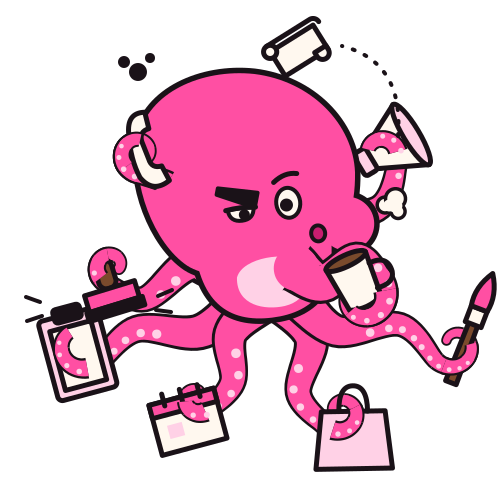
How Ocho's direction looks: one owned colour, hot pink #ff4fa3, on quiet dark or light product screens, DynaPuff and Archivo for type, the sucker print for illustration, and the founder's own photos carrying the colour, with a wordmark slot wherever the open product name goes.
Today
The live product today
| Part |
What it is |
|
| Look |
Dark first, quiet, photographic: page background #0a0a0a, cards #1b1b1b |
brew/public/feed-system.css:10 |
| Body face |
SF Pro Text, then Inter, then system fonts |
brew/public/feed-system.css:31 |
| Hand face |
Caveat, for margin notes |
brew/public/feed-system.css:32; brew/public/index.html:6 |
| Mono face |
SF Mono, then JetBrains Mono |
brew/public/feed-system.css:33 |
| Mark and favicon |
brew-mark.svg, the old name's mark |
brew/public/index.html:1; brew/public/assets/brew-mark.svg |
| Area colours |
Five agent shapes and colours: teal #2bb39b, blue #4a90f0, orange #f28a3c, purple #9a6bf0, green #16a37f |
brand-directions/BRIEF.md section 2; brew/public/assets/agent-performance.svg |
| Character |
None in the product |
brand-directions/BRIEF.md section 3.8 |
Inter is on the team's list of faces that read as an AI default, so today's body face goes with any direction. memory brand-directions-2026-10-25
Ocho's direction, as drawn
Palette
| Token |
Value |
Use |
|
| Ocho pink |
#ff4fa3 |
Owned. Main button, focus, active tab, Ocho. Never a card fill |
brand-directions/octopus/system.md s1; brand-directions/octopus/brand.html b4 |
| Belly |
#ffd1e6 |
Belly and the offset print plate |
brand-directions/octopus/brand.html b4 |
| Ink |
#1a1218 |
Outline, text on pink |
brand-directions/octopus/system.md s1 |
| Deep pink |
#c81d6f |
Pink text on light pages |
brand-directions/octopus/brand.html b4 |
| Night sea |
#0b1020 |
Dark book and marketing page |
brand-directions/octopus/system.md s1 |
| Blush paper |
#fff5f9 |
Light book and marketing page |
brand-directions/octopus/system.md s1 |
| Draft paper |
#fff8ef |
Frames behind Ocho |
brand-directions/octopus/system.md s1 |
| Sticky note |
#ffd84a |
One per page at most, books only |
brand-directions/octopus/system.md s1 |
Product tokens, from the kit skin
| Token |
Dark |
Light |
|
| bg |
#101218 |
#f7f6f5 |
brand-directions/octopus/kit-skin.js tokens |
| surface |
#181b22 |
#ffffff |
brand-directions/octopus/kit-skin.js tokens |
| surface2 |
#21252e |
#efedec |
brand-directions/octopus/kit-skin.js tokens |
| ink |
#f4f1f3 |
#1a1218 |
brand-directions/octopus/kit-skin.js tokens |
| muted |
#a9adba |
#5e5862 |
brand-directions/octopus/kit-skin.js tokens |
| line |
#2c303a |
#e2dedc |
brand-directions/octopus/kit-skin.js tokens |
| hero |
#ff4fa3 |
#ff4fa3 |
brand-directions/octopus/kit-skin.js tokens |
| heroInk |
#1a1218 |
#1a1218 |
brand-directions/octopus/kit-skin.js tokens |
| focus |
#ff7dbb |
#c8146e |
brand-directions/octopus/kit-skin.js tokens |
| radius, radiusSm |
16px, 10px |
16px, 10px |
brand-directions/octopus/kit-skin.js tokens |
| shadow |
0 8px 24px at 30 percent black |
0 8px 24px at 10 percent ink |
brand-directions/octopus/kit-skin.js tokens |
The product set and the book set are never mixed. brand-directions/octopus/system.md s1
Contrast, worked out from the tokens on 26 October
| Pair |
Ratio |
Use |
|
| Ink #1a1218 on pink #ff4fa3 |
About 6.0 to 1 |
Main button label |
computed from brand-directions/octopus/kit-skin.js tokens |
| Pink #ff4fa3 on dark bg #101218 |
About 6.2 to 1 |
Pink on dark |
computed from brand-directions/octopus/kit-skin.js tokens |
| White on pink |
About 3.0 to 1 |
Never for text |
computed from brand-directions/octopus/kit-skin.js tokens |
| Focus #c8146e on light bg #f7f6f5 |
About 5.1 to 1 |
Links and focus on light |
computed from brand-directions/octopus/kit-skin.js tokens |
The book listed Ocho's contrast as not measured, so these numbers are a first pass to confirm with a checker. brand-directions/book/content/f.js:786
Type
| Role |
Face |
Detail |
|
| Display |
DynaPuff, 600 to 700, width 75 to 100 |
Soft and squashy, like a body with no bones. Headlines, numbers, speech bubbles |
brand-directions/octopus/system.md s1; brand-directions/octopus/brand.html b4 |
| Body and UI |
Archivo, 400 to 700, width 62 to 125 |
Crisp in dense lists at 14px, has the rupee sign. Every control |
brand-directions/octopus/system.md s1 |
| Hand |
Mali 600 |
The one sticky note per page, books only, never in the product, never on a button |
brand-directions/octopus/system.md s1; brand-directions/octopus/brand.html b4 |
| Scale |
Display 50, 32, 23. Body 16, 14, 12. Prices in the body face |
|
brand-directions/octopus/system.md s1 |
| Fonts link |
Google Fonts, DynaPuff and Archivo |
|
brand-directions/docs2/data/dirs.json octopus.fonts |
Shapes, motifs and illustration
- The curl: dividers, loaders, the end of every arm. brand-directions/octopus/brand.html b4
- Sucker dots: progress, steps, the memory meter. brand-directions/octopus/brand.html b4
- The ink puff: only for oops, never alarm. brand-directions/octopus/brand.html b4
- Sticky notes and coffee rings: desk clutter, one per screen at most. brand-directions/octopus/brand.html b4
- The sucker print, the one illustration treatment: two inks on draft paper, the belly pink plate off register by 5 pixels right and 4 down, a halftone of sucker dots on an 11 pixel grid fading from one corner, one ink weight of 5 units in a 500 unit frame. No gloss, gradients or soft shadows. brand-directions/octopus/brand.html b4; brand-directions/octopus/system.md s4
- In the kit skin the print shows as a pink drop shadow at 4 by 3 pixels, 30 percent, on every pose but the corner mark. brand-directions/octopus/kit-skin.js motion
Layout
- Quiet product, loud corner: product screens stay dark and photographic, Ocho lives in a fixed corner and the empty states. brand-directions/octopus/brand.html b4
- Desk pages for marketing: paper cards with ink outlines, one sticky note, one coffee ring, bubbles in the background. brand-directions/octopus/brand.html b4
- Cards are rounded with the bottom left corner tighter, like a speech bubble pointing at Ocho. brand-directions/octopus/brand.html b4
Logo and wordmark slot
- The lockup is the small mark on the left and the product name on the right, cap height equal to the eyes. Clear space is one arm curl on every side. On pink grounds the icon sits on a blush circle. brand-directions/octopus/brand.html b4
- The small mark is shown at 24, 40 and 72 pixels for app icon, favicon and avatar. The 16 pixel cut is the head alone. brand-directions/octopus/brand.html b4; brand-directions/octopus/system.md s4
- The product name is open, so a dashed wordmark slot sits wherever it would go. brand-directions/octopus/system.md s0 line 5
Icons and photography
- One rounded line icon set, 2 pixel stroke, round ends, ink or white. No emoji, no glyphs. brand-directions/octopus/brand.html b4
- Area colours stay small chips as tags, never an icon fill, never a page colour, never on Ocho. brand-directions/octopus/system.md s1; brand-directions/octopus/brand.html b4
- The founder's own product photos, untouched, edge to edge in picks. No pink tints, no tentacle frames, Ocho never drawn over a brand's photo. Samples use the candle store. brand-directions/octopus/brand.html b4
Light and dark
- Dark is the default: night sea, white text, pink only for Ocho, primary buttons and the active tab. brand-directions/octopus/brand.html b4
- Light: blush paper, ink text, pink text becomes deep pink #c81d6f. Ocho never changes colour. brand-directions/octopus/brand.html b4
Tomorrow
- v1 Changes: the product takes Ocho's kit skin tokens for dark and light, replacing today's neutral set. Restyle only.
- v1 Goes: Inter and Caveat leave the product. DynaPuff and Archivo replace them, and Mali never enters the product.
- v1 Changes: brew-mark.svg, the favicon and the home screen icon become Ocho's small mark beside the wordmark slot, then the chosen name.
- v1 Stays: the five area colours, only as small tags.
- v1 Stays: the founder's photos carry the colour and are never tinted.
- v1 New: the sucker print on every pose of 120 pixels and up, the plain small mark below that.
- v2 New: a clock and approve stamp join the prop set for posting and scheduling after a yes, drawn in the same six inks.
- v3 New: a scorecard and magnifier for How it went, drawn the same way.
- v4 Stays: no new colour, no new face, no second character.
How we do it
- Owned pink goes on the main button, focus, the active tab and Ocho. Nothing else, and never a card fill.
- Take product values only from brand-directions/octopus/kit-skin.js. Take book and marketing values from system.md s1.
- Check text pairs before any build with a contrast checker; white on pink is never text.
- Load fonts from Google Fonts:
https://fonts.googleapis.com/css2?family=DynaPuff:wdth,wght@75..100,400..700&family=Archivo:wdth,wght@62..125,400..800&display=swap
- Below 120 pixels place char-mark.svg, at 16 pixels char-mark-16.svg. Never scale the full figure down.
- Render every screen at 400 and 1280 pixels in dark and light, and confirm no sideways scroll and Ocho off every control.
Numbers
| Metric |
Definition |
Where measured |
Status |
| Text contrast |
Every text pair at 4.5 to 1 or more |
A contrast check over the kit skin tokens |
Proposed; first pass on 26 October above |
| Owned colour discipline |
Screens where pink appears on anything other than the main button, focus, active tab or Ocho |
A screenshot audit of the 45 screens |
Proposed |
| Untinted photos |
Picks where a founder's photo has any overlay or tint |
The same audit |
Proposed, target zero |
Open
- Is hot pink the colour you want to own for years, given it reads playful in serious rooms? Proposal: yes inside the product and marketing, and turn Ocho down to the small mark in investor and partner decks.
- Should Mali stay as the books' hand face, or should the product keep a hand face for margin notes like Caveat today? Proposal: keep Mali in books only and set margin notes in Archivo, as the system file says.
- Who confirms contrast before the build? Proposal: Arvind runs one contrast check over the kit skin and logs the pairs here.